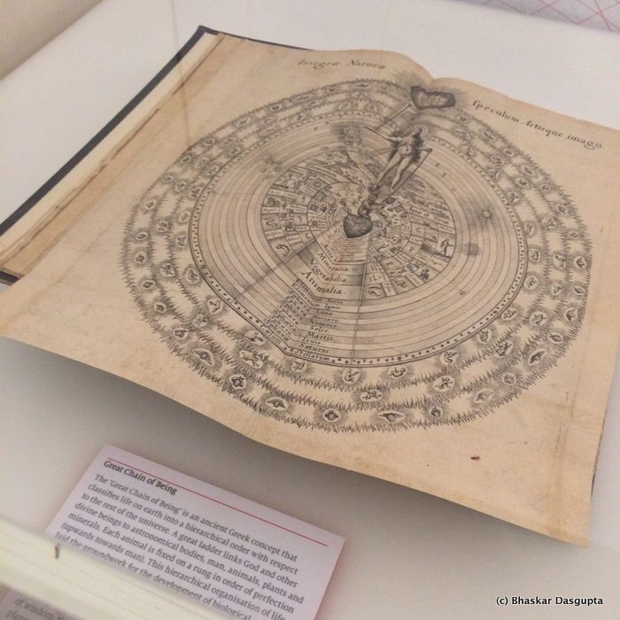
what a lovely diagram. Here's the proper one.
such a wonderful depiction.

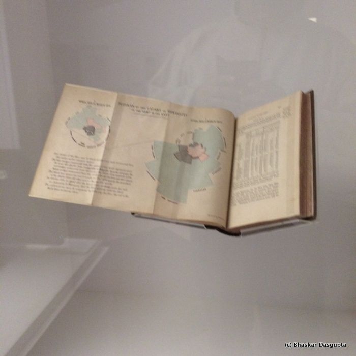
And this is what just blew me away. You know Florence Nightingale was an accomplished nurse, of course, but did you know she was also a statistician as well as a data visualiser? This is the crucial graph which clearly identified how more soldiers were dying due to non battle related causes rather than battlefield injuries.
Here's the proper one.

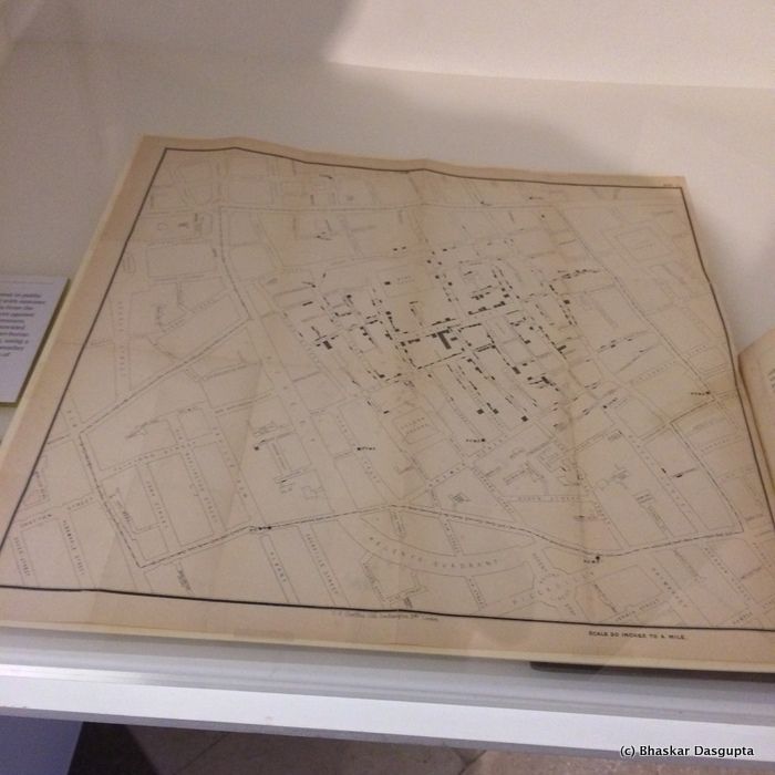
now this is one of the most famous graphs of them all. This is the map where Jon Snow mapped the deaths due to cholera in the early 1800's and then traced it to the Broad Street Water Pump. Most amazing breakthrough.

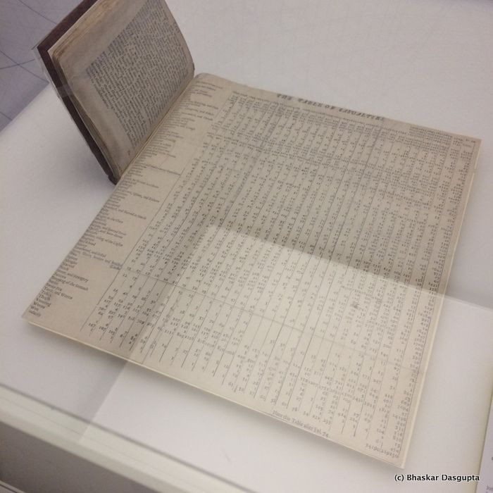
and then another wonderful example of record keeping.
Some more


No comments:
Post a Comment